


SimpleMenu and SimpleMenuItem
The menu is an items control that hierarchically organizes elements
that are associated with commands and event handlers. You can place content in
a menu in Microsoft® Expression Blend™ by double-clicking
the menu
and then drawing an element (such as a rectangle) into it.
Alternatively, you can right-click the menu under Objects
and Timeline, and then click Add SimpleMenuItem
to add individual items to the collection, or click Bind
ItemsSource to Data to generate the collection of
MenuItem elements from a data source. To add a second-level
menu item, you can right-click a menu item under Objects
and Timeline and then click Add
SimpleMenuItem, or add a custom menu item from the Local Styles tab of the Asset Library  .
.
You can edit the text of the menu item by right-clicking the menu item under Objects and Timeline and then clicking Edit Text, or you can make the menu item active by double-clicking it and drawing a control into it. To view the child menu items of a menu item on the artboard while they are expanded, you can right-click the parent menu item under Objects and Timeline, and then click Expand MenuItem.
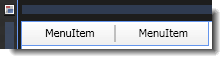
The artboard view of a SimpleMenu control after two items and a separator are added.
Breaking down the control template
The SimpleMenu control template consists of the following items:
- A Grid panel, which is used to hold the multiple children within the menu. The Grid is also used because it makes it easier for an application user interface (UI) designer to add more elements to the template.
- A Border element, which is used because it includes a BorderThickness property that can be template-bound to the BorderThickness property of the menu control to which this template is applied.
- A StackPanel, which is contained within the Grid element and which is used to lay out the menu items. By default, the Orientation property of the StackPanel is set to Horizontal.
The SimpleMenuItem control template consists of the following items:
- A Grid panel, which is used to hold the multiple children within the menu item. The Grid is also used because it makes it easier for a designer to add more elements to the template. This Grid panel uses the concept of size sharing, allowing each menu item to be the same width as all of the other menu items in the menu.
- A ContentPresenter element named Icon, which is bound to the Icon property of the menu item to which this template is applied.
- A Grid panel named GlyphPanel which is used to display a check mark in case the menu item is a checkable item. By default, the Glyph element is collapsed, but it is made visible by the IsChecked trigger.
- A ContentPresenter element named HeaderHost, which is bound to the Header property of the menu item to which this template is applied. The binding is set in the ContentSource property of the HeaderHost element.
- A Grid panel named ArrowPanel, which is used to provide a way to expand the menu item. By default, the ArrowPanel is collapsed, but it is made visible by the Role = SubmenuHeader trigger, which identifies the menu item as a submenu header (a second-level or lower-level menu item that has child menu items).
- A Popup element named SubMenuPopup, which is used to hold any existing child menu items. These are placed into a StackPanel element that is marked as the Items Host so that this menu item knows where to place its child menu items. If you want a different arrangement of the menu items, you can use a different layout panel such as a WrapPanel, by right-clicking the StackPanel element under Objects and Timeline, pointing to Change Layout Type, and then selecting a panel.
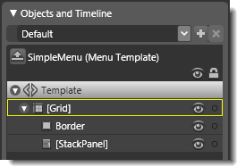
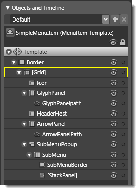
Objects view: The basic parts (template) of a SimpleMenu control (on the left) and a SimpleMenuItem control (on the right).
Property triggers used
Property triggers in the control template are used to make the control react to property changes. You can click the items under Triggers in the Interaction panel to view the properties that are changed when a trigger is active. For example, in the template for the menu item, when the IsChecked property is True, it means that the menu item to which the template is applied is checkable, so the GlyphPanel element is made visible by the trigger.
Brushes used
The following brush resources in the SimpleStyles.xaml resource dictionary are used by the SimpleMenu and SimpleMenuItem templates:
- The Background property of the menu is set by using the LightBrush, and is set by using the DisabledBackgroundBrush when IsEnabled is False.
- The BorderBrush property of the menu is set by using the NormalBorderBrush, and is set by using the DisabledBorderBrush when IsEnabled is False.
- The Background property of the SubMenuBorder element is set by using the WindowBackgroundBrush.
- The BorderBrush property of the SubMenuBorder element is set by using the SolidBorderBrush.
Additionally, the templates use bindings to system colors, which allow the controls to use the system defaults. In many cases, you may want to change these brushes so that you can create a unique design. You can do this by editing the Triggers that set the system colors.
Best practices and design guidelines
- In general, use a Grid control as the root of your template if you expect a designer to add further visual elements to your control. Expression Blend looks for a layout panel like the Grid control and makes it active by default so that new elements that are added to the artboard end up as child elements of the layout panel.
- The pop-up control renders on top of any other controls. This is usually desirable for a menu. The pop-up control itself has logic that allows the offset from the parent control to be set, for example, by setting the Placement property to "Right". In the case of a menu, the menu's expansion is controlled by a binding to the parent control. For the menu to expand correctly you must keep the binding.
- The root Grid panel for the menu item template uses the concept of size sharing, allowing each menu item to be the same width as all the other menu items in the menu. If you want to change this behavior, you need to modify the SharedSizeGroup property in XAML view because Expression Blend does not display this property in the Properties panel. In most cases, you do not need to modify the SharedSizeGroup because it allows the menu to resize properly. As a best practice, you can change the look of the menu item by drawing elements into the root Grid panel of the menu item template instead of rearranging the columns or their content.
- Some of the menu item template triggers work with a property called Role. Role is set depending on the level of the menu item in the menu hierarchy. If you modify the menu item template, you might want to preserve the role-based triggers. The template that is used by the actual system MenuItem control is considerably more complex than SimpleMenuItem. The MenuItem control template uses a style to switch between different control templates based on the role of the menu item. SimpleMenuItem uses a single template to achieve this, and is thus easier to edit.
- To edit the SimpleMenuItem template, click the Edit resource button next to the SimpleMenuItem style in the Resources panel. Then, in the editing mode of the style, right-click Style under Objects and Timeline, point to Edit Control Parts (Template), and then click Edit Template or Edit Copy.
- For information about how to hook up a menu item to a Command, see the Menu Overview on MSDN.