


SimpleProgressBar
The progress bar is a simple control that an application can use to visually indicate the progress of a lengthy operation. By default, the progress bar window is filled from left to right, as the operation progresses. The control has a range and a current position. The SimpleProgressBar in Microsoft® Expression Blend™ only supports a horizontally orientated progress bar.
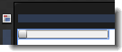
The artboard view of a SimpleProgressBar control after setting the Value property to 10.
Breaking down the control template
The SimpleProgressBar control template consists of the following items:
- A Grid layout panel, which is used to hold the multiple child elements within the progress bar. The Grid is also used because it makes it easier for an application user interface (UI) designer to add more elements to the template.
- A Border element named PART_Track, which is used to represent the bar area to be filled.
- A Border element named PART_Indicator, which is used to represent the bar area that has already been filled.
 |
Do not rename any element whose name begins with "PART_" because these elements are referred to from the code that implements the control. |
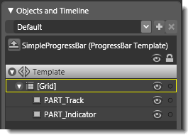
Objects view: The basic parts (template) of a SimpleProgressBar control.
Property triggers used
The SimpleProgressBar control template does not use triggers. All control behavior is implemented in code.
Brushes used
The following brush resources in the SimpleStyles.xaml resource dictionary are used by the SimpleProgressBar template:
- The Background property of the PART_Track element is set by using the PressedBrush.
- The BorderBrush property of the PART_Track element is set by using the SolidBorderBrush.
- The Background property of the PART_Indicator element is set by using the MouseOverBrush.
- The BorderBrush property of the PART_Indicator element is set by using the NormalBorderBrush.
Best practices and design guidelines
- In general, use a Grid control as the root of your template if you expect a designer to add further visual elements to your control. Expression Blend looks for a layout panel like the Grid control and makes it active by default so that new elements that are added to the artboard end up as child elements of the layout panel.
- If you want, you can add triggers to the SimpleProgressBar template, or modify the PART_Indicator element to make the bar look more interesting, but do not rename any element whose name begins with "PART_" because these elements are referred to from the code that implements the control.
- For information about how to hook up a progress bar to the progress of an operation, see the documentation about the ProgressBar Overview on MSDN.