


SimpleScrollBar
The scroll bar is a simple control that displays a marker on a bar in a position that depends on the Value property. You can set the orientation of the scroll bar in Microsoft® Expression Blend™ by using the Orientation property under Layout in the Properties panel. You can set the Minimum, Maximum, and current Value of the scroll bar under Common Properties in the Properties panel. The current value must be between the minimum and maximum values.
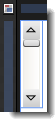
The Artboard view of a SimpleScrollBar control.
Breaking down the control template
The SimpleScrollBar control template consists of the following items:
- A Grid panel named GridRoot, which is used to hold the multiple child elements within the scroll bar. The Grid is also used because it makes it easier for you to add more elements to the template. The Grid is split into three rows where the top and bottom rows have maximum sizes set so that they will not expand beyond 18 pixels (or, device-independent units which are approximately 1/96 inch), and the middle row is set to star (*) size which means that it will expand when the window expands.
- Two RepeatButton elements named DecreaseRepeat and IncreaseRepeat, which are used to move the position marker on the bar. The RepeatButton elements contain content that displays arrows. Again, a Grid is used as a root for each of these so that the user can easily edit the Path elements (named DecreaseArrow and IncreaseArrow) and add other content.
- A Track element named PART_Track, which is used to display a Thumb element along a bar. The exposed parts of the bar double as RepeatButtons named PageDown and PageUp. Both of these use the SimpleScrollRepeatButtonStyle template, which can be edited separately. The IncreaseRepeatButton and DecreaseRepeatButton sections of the track use Command bindings so that they can call commands on the scroll bar class. The Thumb element uses the SimpleThumbStyle template, which can be edited separately.
- A layout transform, which is used to display the slider bar in a horizontal orientation. This design makes it easier to edit than having to remember to edit two different templates. However, there are cases when the two orientations need to be sufficiently different that they require separate templates. In this case, you could use a Setter in the <Style> element in XAML view of Expression Blend to switch the templates based on orientation. You can find an example of this in the default template for the system ScrollBar control.
 |
Do not rename any element whose name begins with "PART_" because these elements are referred to from the code that implements the control. |
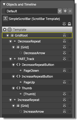
Objects view: The basic parts (template) of a SimpleScrollBar control.
Property triggers used
Property triggers in the control template are used to make the control react to property changes. You can click the item under Triggers in the Interaction panel to view the properties that are changed when a trigger is active. For example, in the SimpleScrollBar template, when the Orientation property is Horizontal, multiple properties are changed to reflect the new orientation of the progress bar.
Brushes used
The SimpleScrollBar template only uses one system brush resource for the Foreground property. Other brush resources are referenced in the templates that the SimpleScrollBar uses, such as the SimpleRepeatButton, SimpleThumbStyle, and SimpleScrollRepeatButtonStyle templates. You can modify the brushes that these templates use, to change the look of the SimpleScrollBar, or you can create new templates.
Best practices and design guidelines
- In general, use a Grid control as the root of your template if you expect a designer to add further visual elements to your control. Expression Blend looks for a layout panel like the Grid control and makes it active by default so that new elements that are added to the artboard end up as child elements of the layout panel.
- You can apply the SimpleScrollBar template to the scroll bar that is used in the template for a ScrollViewer.
- Because the SimpleScrollBar template uses other templates, it can be tedious to walk through various levels of templates to get to the one that you want to change. To edit templates directly, you can click the Edit resource button next to the template name in the Resources panel. Then, in the editing mode of the style, right-click Style under Objects and Timeline, point to Edit Control Parts (Template), and then click Edit Template or Edit Copy. Alternatively, it can be simpler to just delete the references to the sub-templates (reset the Style property under Miscellaneous in the Properties panel), and design your template at the first level.
- In order for your control to work, you need to keep the command bindings that fire commands on the control’s class and provide another way to make a contract between the control and the class that represents it. These bindings are present in the Command properties of the IncreaseRepeat, DecreaseRepeat, PageUp, and PageDown elements, and in the Orientation=Horizontal trigger.
- If you want, you can add triggers to the SimpleScrollBar template, or modify the elements in the PART_Track element to make the bar look more interesting, but do not rename the PART_Track element or any of its child elements because these elements are referred to from the code that implements the control. The PART_Track element knows how to find its parts because they are placed under specific control headers: Track.IncreaseRepeatButton, Track.DecreaseRepeatButton, and Track.Thumb. The Thumb is also a specific Windows Presentation Foundation (WPF) control that knows how to be dragged.