


SimpleSlider
The slider is a simple control that lets a user select from a range of values by moving a Thumb control. By default, the slider displays horizontally, but you can change it to vertical by setting the Orientation property under Common Properties in the Properties panel of Microsoft® Expression Blend™. To set the value of a slider, use the Minimum, Maximum, and Value properties.
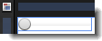
The artboard view of a SimpleSlider control.
Breaking down the control template
The SimpleSlider control template consists of the following items:
- A Grid panel named GridRoot, which is used to hold the multiple child elements within the slider. The Grid is also used because it makes it easier for an application user interface (UI) designer to add more elements to the template. The GridRoot is split into three rows: the top row holds the TopTick element, the middle row holds the Thumb element, and the bottom row holds the BottomTick element.
- Two TickBar elements named TopTick and BottomTick, which are used to show ticks on the slider. By default, their Visibility property is set to Collapsed. The TickBar elements determine the number of tick marks to show based on the properties that are set on the slider control to which this template is applied. The TickBar elements do not provide an editable template, but you can set the brush they use to show the tick mark by setting the Foreground property on the slider control (this TickBar is template-bound to the Foreground property of the slider control).
- A Border element, which is used because it includes a BorderThickness property that can be template-bound to the BorderThickness property of the button control to which this template is applied.
- A Track element named PART_Track, which is used to display a Thumb element along a bar. The user can drag the Thumb element. By default, the Thumb element uses the SimpleThumbStyle template, which you can edit.
- Two RepeatButton elements, which are contained within the PART_Track element and which allow the user to click either side of the thumb to make larger changes to the slider value. You can specify the step value for these changes in the LargeChange property of the slider (not the template). The step value that is specified by the SmallChange property is used when the user moves the thumb by using the arrow keys.
- A layout transform, which is used to display the slider in a horizontal orientation. This design makes it easier to edit, so that you don't have to remember to edit two different templates. However there are cases when the two orientations need to be sufficiently different that they require separate templates. In this case, you could use a Setter in the <Style> element in XAML view in Expression Blend to switch the templates based on orientation. An example of this can be found in the default template for the system Slider control.
 |
Do not rename any element whose name begins with "PART_" because these elements are referred to from the code that implements the control. |
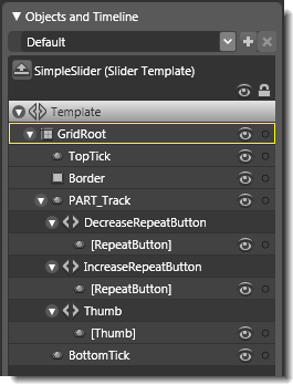
Objects view: The basic parts (template) of a SimpleSlider control.
Property triggers used
Property triggers in the control template are used to make the control react to property changes. You can click the items under Triggers in the Interaction panel to view the properties that are changed when a trigger is active. For example, in the SimpleSlider template, triggers are used to make the TickBar elements appear based on the TickPlacement property. This sets visibility on the TopTick and BottomTick elements. Horizontal and Vertical orientation are also configured in the triggers of the SimpleSlider template. This applies a layout transform on the slider that rotates it 90 degrees. Because the track automatically orientates itself, it is forced back so that it won't be rotated twice.
Brushes used
The following brush resources in the SimpleStyles.xaml resource dictionary are used by the SimpleSlider template:
- The Background property is set by using the LightBrush when no trigger is active, and is set by using the DisabledBackgroundBrush when IsEnabled is False.
- The BorderBrush property is set by using the NormalBorderBrush when no trigger is active, and is set by using the DisabledBorderBrush when IsEnabled is False.
- The Foreground property of the TopTick element is set by using the GlyphBrush.
- The Fill property of the SimpleThumb template is set by using the NormalBrush, and the Stroke property is set by using the NormalBorderBrush.
Best practices and design guidelines
- In general, use a Grid control as the root of your template if you expect a designer to add further visual elements to your control. Expression Blend looks for a layout panel like the Grid control and makes it active by default so that new elements that are added to the artboard end up as child elements of the layout panel.
- If you want, you can add triggers to the SimpleSlider template, or modify the PART_Track element to make the slider look more interesting, but do not rename any element whose name begins with "PART_" because these elements are referred to from the code that implements the control. The Thumb and repeat buttons need to be placed in the correct elements within Track. The track control knows how to place the Thumb element based on the Slider value. The repeat buttons use Command bindings to cause the value of the slider to increase or decrease.
- When you edit the template of SimpelSlider, you can force the TickBar elements to appear by using the Triggers area of the Interaction panel to select the appropriate trigger. For example, in the SimpleSlider template, when TickPlacement is set to Both, both TickBar elements are shown by setting their Visibility property to Visible.