


SimpleTabControl and SimpleTabItem
The tab control is an items control that displays content in tabs. Typically, the child elements of a tab control are tab items, which are headered content controls, each of which can have a header element and a content element. You can place items in a tab control in Microsoft® Expression Blend™ by right-clicking the tab control under Objects and Timeline, and then clicking Add SimpleTabItem to add individual items to the collection, or by clicking Bind ItemsSource to Data to generate the collection of tab item elements from a data source. .
You can edit the text of the tab item by right-clicking it under Objects and Timeline, and then clicking Edit Text, or you can make the tab item active by double-clicking it and drawing a control into it.
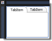
The artboard view of a SimpleTabControl control after two SimpleTabItems are added.
Breaking down the control template
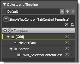
The SimpleTabControl control template consists of the following items:
- A Grid layout panel, which is used to hold the multiple child elements within the tab control. The Grid is also used because it makes it easier for an application user interface (UI) designer to add more elements to the template. The top row of the Grid uses auto-sizing so that it changes height with the size of the biggest tab item. The bottom row uses star (*) sizing so that it takes up the remaining space to display the content of the tab item (the PART_SelectedContentHost).
- A TabPanel element named HeaderPanel, which is a custom layout panel that knows how to organize tab items.
- A Border element, which is used because it includes a BorderThickness property that can be template-bound to the BorderThickness property of the tab control to which this template is applied.
- A ContentPresenter element named PART_SelectedContentHost, which is used to display the Content property of the tab control to which this template is applied.
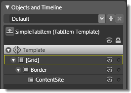
The SimpleTabItem control template consists of the following items:
- A Grid layout panel, which is used to hold the multiple child elements within the tab control. The Grid is also used because it makes it easier for an application UI designer to add more elements to the template. This Grid panel uses the concept of size sharing, allowing each tab item to be the same width as all of the other tab items in the tab control.
- A Border element, which is used because it includes a BorderThickness property that can be template-bound to the BorderThickness property of the tab control to which this template is applied.
- A ContentPresenter element named ContentSite, which is bound to the Header property of the tab item to which this template is applied. The binding is set in the ContentSource property of the ContentSite element.
Objects view: The basic parts (template) of a SimpleTabControl control (on the left) and a SimpleTabItem control (on the right).
Property triggers used
Property triggers in the control template are used to make the control react to property changes. You can click the items under Triggers in the Interaction panel to view the properties that are changed when a trigger is active. For example, in the template for the tab item, the trigger for IsSelected sets the ZIndex property on the tab item, which forces it to the front. For this reason, this trigger needs to be kept if the tab item is to work correctly. The IsSelected trigger also sets a thicker BorderThickness and changes the Background color to show that the item is selected.
Brushes used
The following brush resources in the SimpleStyles.xaml resource dictionary are used by the SimpleTabControl and SimpleTabItem templates:
- The Background property of the tab control is set by using the WindowBackgroundBrush when no trigger is active.
- The BorderBrush property of the tab control is set by using the SolidBorderBrush when no trigger is active, and is set by using the DisabledBorderBrush when IsEnabled is False.
- The Foreground property of the tab control is set by using the DisabledForegroundBrush when IsEnabled is False.
- The Background property of the Border element of the tab item is set by using the LightBrush when no trigger is active, is set by using the WindowBackgroundBrush when IsSelected is True, and is set by using the DisabledBackgroundBrush when IsEnabled is False.
- The BorderBrush property of the Border element of the tab item is set by using the SolidBorderBrush, and is set by using the DisabledBorderBrush when IsEnabled is False.
- The Foreground property of the tab item is set by using the DisabledForegroundBrush when IsEnabled is False.
Additionally, the templates use bindings to system colors, which allow the controls to use the system defaults. In many cases, you may want to change these brushes so you can create a unique design. You can do this by editing the triggers that set the system colors.
Best practices and design guidelines
- In general, use a Grid control as the root of your template if you expect a designer to add further visual elements to your control. Expression Blend looks for a layout panel like the Grid control and makes it active by default so that new elements that are added to the artboard end up as child elements of the layout panel.
- The TabPanel element named HeaderPanel in the template is a specific layout panel used for TabControl. A TabPanel knows how to lay out tab items in multiple rows, and how to layer them when a tab item is selected. You can use a different layout container for the HeaderPanel, but you need to set its IsItemsHost property to True.
- To edit the SimpleTabItem template, click the Edit resource button next to the SimpleTabItem style in the Resources panel. Then, in the editing mode of the style, right-click Style under Objects and Timeline, point to Edit Control Parts (Template), and then click Edit Template or Edit Copy.
- The control template for the system TabControl is considerably more complex than the SimpleTabControl. It allows the TabPanel to be docked in different directions based on the Orientation property of the TabControl. The SimpleTabControl ignores the Orientation property for simplicity, but if you want the TabPanel to be placed in a different location you can edit the grid rows and columns.
- The ContentPresenter element that is named PART_SelectedContentHost should not be renamed because the control’s class knows to look for this name as the place to show the tab item.