


Make an object into a button
- To create a button from an object
- To modify the style of your button
- To apply a button style to a button
- To remove or change the style of a button
You can use the Make Button feature in Microsoft® Expression Blend™ to make a button out of any object on the artboard, such as an image or a shape. The Make Button tool wraps the object in a style resource that you can apply to any other button object.
 |
An object in Expression Blend is anything that you place onto the artboard, such as a layout panel, shape, text control, image, button, control template, or any other user interface (UI) design element. Placing a UI element onto the artboard creates an object instance of the element in your application. |
To create a button from an ellipse
- If you have not already done so, open or create a new project. For more information, see Create a new document or project.
- On the artboard, draw a circle by using the Ellipse
 tool
in the Toolbox. To make the ellipse more visible, you can
change its appearance by altering its properties under Brushes
in the Properties panel. For more information, see
Brushes.
tool
in the Toolbox. To make the ellipse more visible, you can
change its appearance by altering its properties under Brushes
in the Properties panel. For more information, see
Brushes. - With the ellipse selected under Objects and Timeline in the Interaction panel, click Make Button
on the
Tools menu to convert the ellipse to a button.
The Create Style Resource dialog box opens. - Under Resource name (Key), select the first radio button (default), and then enter a name to be used to identify the button style. Alternatively, you could select the Apply to all option that would apply the style to all buttons on the artboard that do not already reference a style by name.
- Under Define in, click the option that reflects where you want the button style to be defined. Click Application to make the button style available to any document in your application. Click This document (Window: Window) to make the button style available only to the current document. Click Resource dictionary to define the button style in a resource dictionary in your application.
- Click OK to exit the Create Style Resource
dialog box and to create the button style.
Notice that under Objects and Timeline, the ellipse object is converted to a button object whose style is set to your new button style.
Additionally, the button style is listed in the Resources tab in the node where it was defined (for example, in the Window node).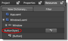
The new button style as it appears in the Resources tab of Expression Blend.
To modify the style of your button
- To modify the button style that you just created, right-click the new
button object under Objects and Timeline, point to Edit
Control Parts (Template), and then click
Edit Template.
The artboard switches to the editing scope of the control template.There are multiple ways that you can enter the editing scope of a control template: - Right-click the object under Objects and Timeline, point to Edit Control Parts (Template), and then click Edit Template.
- Select the object under Objects and Timeline, and then on the Object menu, point to Edit Control Parts (Template), and click Edit Template. (You can also enter the editing scope of the style from the Object menu.)
- In the Resources tab, click the Edit resource button beside the resource name. This takes you to the editing scope of the style, from which you can go to the editing scope of the control template by using either of the two preceding methods.
 under Objects and Timeline.
If you entered the editing scope of the control template from the
editing scope of the style, you will be returned to the style. Click the
Scope Up button again to return to the editing mode of
the document.
under Objects and Timeline.
If you entered the editing scope of the control template from the
editing scope of the style, you will be returned to the style. Click the
Scope Up button again to return to the editing mode of
the document.The Make Button tool wraps the original object (the ellipse) in a style resource that contains a control template. The style defines the properties that are set on the object to which the style is applied (in this case, a button object). The control template defines the states, structure, and appearance of the object.
Inside the control template is a Grid panel that contains the original object (the ellipse) and a ContentPresenter element that displays the content of the button object. Placing your object inside a Grid panel enables you to quickly add and arrange other elements.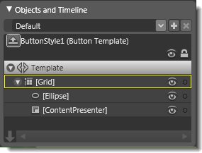
The structure of the control template for the new button style.
You can see how the style and the control template are related by looking at the Extensible Application Markup Language (XAML) for the resource. For example, the structure of the button style might look like the following:<Window.Resources> <Style x:Key="ButtonStyle1"...> <Setter Property="Template"> <Setter.Value> <ControlTemplate TargetType="{x:Type Button}"> <Grid> <Ellipse> ... </Ellipse> <ContentPresenter.../> </Grid> <ControlTemplate.Triggers>...</ControlTemplate.Triggers> </ControlTemplate> </Setter.Value> </Setter> </Style> </Window.Resources> - Under Triggers in the Interaction
panel, define the states of the button as desired. For example, click
IsMouseOver = True to activate trigger recording for the
state when the user passes their mouse over the button. Select the ellipse
under Objects and Timeline, and then under Appearance
in the Properties panel, change the Fill property
of the ellipse to a different color. Notice that a new property change for
ellipse.Fill is added under Triggers under Properties when active,
as shown in the following image.

You might have to adjust the size of the Triggers pane to see the Properties when active section. To adjust the size, click and drag the borders of the pane and the border within the pane. 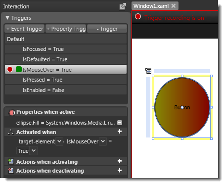
The Triggers panel after changing the Fill of the ellipse when the pointer is over the button.
- You can also add animation to the button. For example, in the Triggers
panel, click IsPressed = True to activate trigger
recording for the state when the user clicks the button. With the ellipse
still selected under Objects and Timeline, hold the SHIFT and ALT keys while you drag one corner
of the ellipse. (The SHIFT+ALT key combination maintains the center
point of the object.)
Alternatively, you can add more complicated animation by creating a new timeline and triggering that timeline from an Event Trigger for the IsPressed event. For more information, see Animation and Interactivity in this User Guide. - After you have defined the states of the button as desired, click the
Scope
Up button
under
Objects and Timeline to return to the editing scope of the document.
- To test the states, click Test Project on the Project menu (or press F5), and then see if the button states are working properly. For example, when you move the pointer over the button, the fill color should change.
To apply a button style to a button
- Make sure that you are in the editing scope that you want. You can apply a style to a button in any scope, including within the scope of a control template.
- On the artboard, draw a button by using the Button
 tool
in the Toolbox.
tool
in the Toolbox. - Right-click the new button object under Objects and Timeline, point to Edit
Control Parts (Template), point to Apply Resource,
and then select your button style from the list.
You can also use the Edit Style and Edit Control Parts (Template) commands on the Object menu to apply a style resource.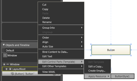
Applying the button style to a button object, by using the right-click method.
To remove or change the style of a button
Because the button style is a resource, you can treat it like any other resource. For information about removing or altering style resources, see the How to topics in Managing assets and resources in this User Guide.