Data overview
Data is the heart of every user interface. From hotel reservations to stock market visualizations, user interfaces generally provide a way to visualize and interact with some form of data. The choice of which user interface components you use, and how you lay them out to provide a useful workflow, relies heavily on the nature of the data that you will be working on.
Data sources
Your application might need to work only with internal data sources, perhaps performing calculations on some numbers that a user has entered into a form. Other applications that you create might need to access external data sources, such as databases, Web feeds, Web services, or local files that contain information. And in some cases, applications might need to access both internal and external data sources. Microsoft® Expression Blend™ currently supports two types of external data sources: XML and CLR Object.
- XML Data Source A local or remote XML file that can supply your application with data in XML format. You can use an XML file that you have added to your project, or you can set the data source to the URL of an XML file on a Web site.
- Common Language Runtime (CLR) Object Data Source An
object that contains public properties, sub-properties, and indexers to which
you can bind your target properties. You can use a Microsoft® .NET Framework
class library that converts data from a data base to an ObservableCollection. For more information, see
Create a CLR object data source, or see the
Data Binding
Overview topics on MSDN.

Expression Blend does not support a CLR Object data source class that includes parameters in the constructor.

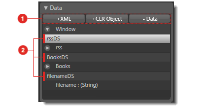
A list of data sources in the Project panel of Expression Blend.
External data sources that are associated with the active document in
Expression Blend are listed under Data in the
Project panel. You can use the buttons
![]() to add and remove data sources, and you can drag data items
to add and remove data sources, and you can drag data items ![]() onto the artboard to create controls that are data-bound to the items. If no
data are sources set up,
Data in the
Project panel only displays the buttons that are used to create a data
source.
onto the artboard to create controls that are data-bound to the items. If no
data are sources set up,
Data in the
Project panel only displays the buttons that are used to create a data
source.
Data binding
Data binding is the process of connecting items in a data source to user interface components (controls). This means that whenever the data changes, the interface components will optionally reflect those changes, and vice versa. The simplest example of data binding would be a slider bar control that is internally bound to the width of a rectangle. Moving the slider bar would scale the rectangle larger and smaller.
Microsoft Windows® Presentation Foundation and Expression Blend provide a simple and consistent way to bind the elements in your application to different data sources, and to configure the elements that display the data and modify the data. A binding is essentially constructed between a source and a target. The source is typically a data source or another control, and the target is a control. In the slider bar example, the source is the Value property of the slider bar control, and the target is the Width property of the rectangle.
You can create bindings by using the Advanced Property Options ![]() button
that is
associated with properties in the Properties
panel, or by dragging items from under Data in the
Project panel to the artboard. (For instructions, see
Bind data to a property or element.) Both options open the Create Data Binding dialog box
to enable the creation of binding links between a control (the target) and a
data field or other control (the source).
button
that is
associated with properties in the Properties
panel, or by dragging items from under Data in the
Project panel to the artboard. (For instructions, see
Bind data to a property or element.) Both options open the Create Data Binding dialog box
to enable the creation of binding links between a control (the target) and a
data field or other control (the source).

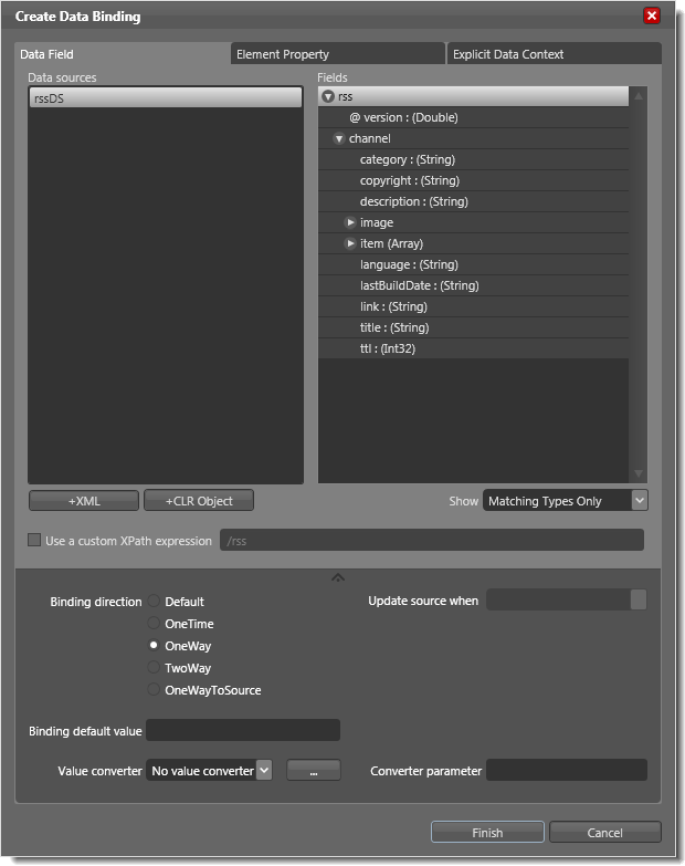
The Create Data Binding dialog with the Advanced Options section expanded.
The Create Data Binding dialog box presents three basic options to select a data source, as well as advanced options:
- Data Field This option presents the XML and CLR Object data sources created in the project, and their associated fields. You can add new a XML data source or CLR Object data source, or use existing connections that have already been created. To select a field to bind to, select an item under Data sources, and then select a data item from under Fields. The type of the data item must match the type of the property to which it is being bound unless you have a value converter that you can apply (see "Advanced Options" later in this topic). After the data binding is created, the value of the target's property is populated with the data item.
- Element Property This option enables binding
an element’s property to another element’s property in the same Extensible
Application Markup Language (XAML) file,
similar to binding the Width property of a rectangle to the Value property of a
slider bar in the example mentioned earlier in this topic. To create this binding, locate the target
property (in this case, the Width property of a rectangle) in the Properties
panel, click the Advanced Property Options
 button, and then click Data Binding.
Click the Element Property tab, navigate the elements in the
left pane to locate the slider bar (source element), and then navigate the list of
properties in the right pane to find the Value property.
 - Explicit Data Context This option allows you to bind to a data source within the context that is specified for the current element or one of its parents. A data context is a convenient way to share data between multiple controls by establishing a scope within which all data-bound properties inherit a common source. For instance, you can assign a data context to a grid object that contains a ListBox object and a TextBlock object, and bind properties of both objects to different data items within the same context. This is useful when you want to create a master-details design, where if you click an item in a list (the master pane), the information about that item appears in another object (the details pane). The Fields pane in the Explicit Data Context tab lists the data connection fields that are available from the inherited data context, from which you can choose the appropriate one for the target property.
-
Advanced Options
The advanced section of the dialog box,
which you can access by clicking the bottom expander
 , enables the setting of advanced
options such as the direction of data flow (see Data flow
later in this topic), a default value for the target property, and a value converter and converter
parameter. Value converters are .NET Framework class methods that are used to convert values from
one type to another, and which are needed when the source and target properties have
mismatching types. You can add a value converter by clicking the “…” button next
to the value converter box and then choosing one from the Add Value Converter
dialog box. You can also specify a converter parameter (for
example, to convert from double
to decimal, you may need to specify a value for the number of digits to show
after the decimal points). For an example of a value converter, see
Create and apply a value
converter.
|
|
In all three options listed above, you can choose to use a custom path or an XML Path Language (XPath) expression for your data binding. The XPath is automatically populated with the path to the item that you select under Fields. However, you can append to the path to narrow down the data that you bring in from the data source, for example by identifying specific nodes in the XML data that you want, such as one item in an array. For more information about using XPath, see the topics XPath Syntax and How to: Bind to XML Data Using an XMLDataProvider and XPath Queries on MSDN. |
Data flow
Data flow is defined as the direction in which your data flows between the source and the target. In the case of the slider bar that scales a rectangle, you would only need one-way binding, from the slider bar (source) to the rectangle (target). Windows Presentation Foundation provides the following binding configurations for data flow:
- OneWay Changes that are made to the source automatically update the target, yet changes to the target don’t update the source.
- TwoWay Changes that are made to the source automatically update the target, and vice versa.
- OneWayToSource This is the reverse of OneWay and it automatically updates the source after the target changes. This is useful in special cases when the target property is not visible in the Properties panel, which can happen if it is not a dependency property. OneWayToSource binding would allow you to set the data binding on the target instead.
- OneTime Which causes a one time initialization from the source to the target, but subsequent changes to the source don’t update the target.
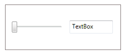
To see data flow in action, consider the following example user interface that contains a Slider control (source) and a TextBox control (target):

Illustrating data flow through binding types.
In the example illustration above, the binding is set on the text box (target) by using the following procedure:
- In the Properties panel, the the Advanced Property Options
 button
that is
associated with the Text property (under Common
Properties) of the TextBox
is clicked, and Data Binding is selected.
 - In the Create Data Binding dialog that appears, the Element Property tab is selected, and the Value property of the Slider is selected.
The following table describes the binding behavior for this example, depending on the binding type:
| Binding type | Result |
|---|---|
OneWay |
Moving the slider bar (source) will update the text box (target). However, entering a number in the text box does not move the slider bar. |
TwoWay |
Moving the slider bar (source) will update the text box (target). Additionally, the position of the slider bar will change when a number is entered in the text box after the mouse clicks outside of the text box. |
OneWayToSource |
Entering a number in the text box (target) and then clicking outside of the text box will move the slider bar (source). However, moving the slider bar will not update the text box. |
OneTime |
The initial value of the slider bar (source) will update the text box (target) when the application starts. Subsequent changes to the slider bar will not update the text box, and entering a number in the text box will not update the slider bar at all. |
Methods of binding to external data sources
Workflow 1: Binding from the source to the target
After your external data source is created, you can bind that data source to user interface controls. There are two approaches to accomplish this:
- Binding an existing control If the control is already in the document, you can bind it to the data by dragging the data node from under Data in the Project panel onto the control and then choosing the control’s name (Bind property to control) under Bind to Existing Control from the list that appears.
- Creating a new control Alternatively, you can drag any data node from under Data in the Project panel into a document, and then choose a control from the list that appears under the Select a Control to represent this data field section. This option will insert a new control into the document.
Whether you choose to bind an existing control or create a
new one, the Create Data Binding dialog box opens, so that you
can select the field
that you
would like to bind to the data source. For instance, if you create a binding by dragging a data item that is a string onto a TextBox, you will
probably want to bind to the Text field (which selected by default) of this node. You can
also specify additional binding settings by clicking the expander
![]() in the
dialog box. Click OK to close the dialog box and create the binding. If the data is
available at design time, the value of the selected field should update the
control. For instructions, see
Bind data to a property or element.
in the
dialog box. Click OK to close the dialog box and create the binding. If the data is
available at design time, the value of the selected field should update the
control. For instructions, see
Bind data to a property or element.
If the data item is a collection of items (an Array), or if the data item does not exactly match the target type, the Create Data Template dialog box will open so that you can choose specific controls to display your data. For more information, see Data templates later in this topic.
Workflow 2: Binding from the target to the source
While the previous workflow started always from the data source and ended at the target control, you can reverse the process if you have already created the control and know which property you would like to bind to your data source, or to another control’s property. This workflow is particularly helpful in element-to-element binding.
Next to each
property value editor in the Properties panel, you will find a
Advanced Property Options ![]() button
that allows you to set
Advanced Property Options, including data binding. Clicking Data
Binding on the advanced options menu will open the same Create Data Binding dialog box
as is described in Workflow 1 earlier in this topic.
button
that allows you to set
Advanced Property Options, including data binding. Clicking Data
Binding on the advanced options menu will open the same Create Data Binding dialog box
as is described in Workflow 1 earlier in this topic.
Data templates
Often times, you will find yourself in a situation where you want to display a list of items from your data source. A data item that contains a list of items is identified by "(Array)" in the item name. When you drag a list node from under Data in the Project panel into a document and select ListBox from the list of optional controls to bind to, you will be presented with an additional dialog box titled Create Data Template that lets you design the data template. This dialog box might also open when you are binding text controls to data items that are strings.
A data template defines the structure and format in which you would like your data to be represented. For instance, if you are binding the ItemsSource field of a ListBox control to a list of contact nodes in your data source, the data template is your way of specifying which fields from this list you will include, and what controls should be assigned to each field. You might choose to represent a name as a TextBlock, a picture as an Image, and a Boolean field such as IsCurrentMember as a CheckBox. Creating a data template ensures that the data in your connection nodes translates into the visual format that you desire. The template allows very fine-grained control over how arbitrary data is displayed in the control.
|
|
Only Content and ItemsSource properties support data templates. |
In the Create Data Template dialog box, you have the option to:
- Use the default styling for the control. In the case of binding to a list of items, the default styling is most often a sequence of text boxes. For more information, see the Data Templating Overview on MSDN. This option is disabled if there is no default template for the control.
- Use a current or predefined data template already in the project. This option is disabled if no suitable data template resource already exists for the control.
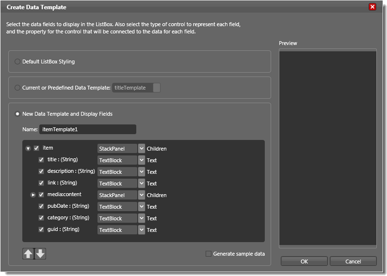
- Specify a new data template and display fields. This option allows you to choose which data fields are included in the template and to select the type of control that should be assigned to each data field. You can also choose what type of container element is wrapped around all of the fields, by clicking the drop-down arrow next to the control that is listed for the top-most item. In the example that is illustrated by the image below, if you clicked the drop-down arrow for the StackPanel next to item, and then selected Grid, the data template would use a Grid instead of a StackPanel as the container for your items. Use the arrow buttons to determine the order in which the data fields appear. If you do not have a live data binding, select the Generate sample data check box so that you can view your control with sample data on the artboard to determine whether you like the look of your template.
Use the Preview pane to determine whether you like the look of your template.

The Create Data Template dialog box.
Data templates are stored as resources. If you want to modify an existing data template, you can click the Edit resource button next to the data template in the Resources panel. Expression Blend will enter template editing mode and will display the structure of your template under Objects and Timeline. In this editing mode, you can add controls to your template and use data binding from the Properties panel to bind the properties of those controls to new items from the data source.


