


Create a CLR object data source
- Defining and filling a DataTable
- Adapting the data collection to a WPF collection
- Binding to the data source in Expression Blend
In Microsoft® Expression Blend™, you can work with XML data sources and CLR Object data sources. XML data sources are simple to work with, but CLR object data sources are considerably more complicated. The following procedures show you how to display data from a common language runtime (CLR) data source in your Expression Blend application. The first two tasks involve obtaining data from a sample database and then converting the data to a format that Expression Blend can bind to. The third task involves creating an Expression Blend project that has elements that are bound to the data.
 |
To follow the procedures in this topic as they are written, you need
Microsoft® Visual Studio® 2005 and Microsoft® SQL
Server™ 2005 with the AdventureWorks
sample database installed. For more information about how to obtain the
AdventureWorks sample, see
Installing
AdventureWorks Sample Databases and Samples on
MSDN. If you prefer, you can create a DataTable or
DataSet from another database. If you do so, please
adapt the first and second tasks in this topic to suit the data
that you have. The principles will be exactly the same as long as you
are using a CLR (or Microsoft® .NET Framework) data source. |
Defining and filling a DataTable
The following procedure describes how to create a class library in Visual Studio 2005 to populate an instance of a DataTable with data from the AdventureWorks sample database.
- On the File menu of Visual Studio 2005, point to New, and then click
Project.
The New Project dialog box opens. - Under Project Types, click Visual C#.
Under Templates, click Class Library. Name the new project AWDataSource,
and then click OK.
Visual Studio generates the code for your new class library project and opens the Class1.cs file for editing. - In the Class1.cs file, change the name of the public class definition from Class1 to ProductPhotosCollection.
This name is more descriptive. - In Solution Explorer, right-click the name of your project (AWDataSource),
point to
Add, and then click New Item.
The Add New Item dialog box opens. - Select DataSet
from the list of templates, name the item ProductPhotos.xsd, and then
click Add.
A DataSet is added to your project in the form of a schema file and supporting class files, and the schema file is opened for editing.
A DataSet is an object that contains data tables in which you can temporarily store data in-memory for use in your running application. For more information, see Datasets in Visual Studio Overview on MSDN. - In Server Explorer,
right-click Data Connections, and then click Add
Connection.
The Choose Data Source dialog box opens. - The Data source field should already list
Microsoft SQL Server (SqlClient).
If you are not going to use an SQL database, click the Change button to select your alternative data source. The following steps will not match what you will see in the Choose Data Source dialog box of Visual Studio. - In the Server Name field, enter the name of the SQL Server
instance on which the AdventureWorks database is installed.
If you are going to use an SQL database other than the AdventureWorks database, select the name of the server that has your SQL database installed. - Under Log on to the server, select the authentication method that is required to log on to your SQL Server instance. You might have to contact the server administrator for that information. Windows Authentication uses your current logon credentials. SQL Server Authentication requires the user name and password of the account that is configured to have access to your database.
- Under Connect to a database, select the AdventureWorks database, which will be visible only if your logon credentials are correct and the AdventureWorks database is installed on the selected SQL Server computer.
- Click the Test Connection button.
If the test connection does not succeed, see your SQL Server administrator for assistance. - Click OK to complete the creation of the data connection.
In Server Explorer, a new connection appears under the Data Connections node named <servername>.AdventureWorks.dbo. - In Server Explorer, expand the new <servername>.AdventureWorks.dbo connection node, expand the Tables node, and then locate the ProductPhoto table.
With the ProductPhotos.xsd file open on the design surface, drag the ProductPhoto table
from Server Explorer onto the design surface.
You now have a typed dataset that is capable of connecting to the AdventureWorks database and returning the contents of the ProductPhoto table. - In the Class1.cs file, add the following method inside the ProductPhotosCollection
class:
    private void GetData()

    {

        ProductPhotosTableAdapters.ProductPhotoTableAdapter da =


            new ProductPhotosTableAdapters.ProductPhotoTableAdapter();

        ProductPhotos.ProductPhotoDataTable dt = da.GetData();

    }
The ProductPhotosTableAdapters namespace is defined in the ProductPhotos.Designer.cs file, which was generated by Visual Studio when you created the ProductPhotos DataSet.
You now have a method that will fill an instance of a ProductPhotos DataTable with data when your application is run. - Build your project (F6) to make sure there are no errors.
Adapting the data collection to a WPF collection
The following procedure describes how to create a class library in Visual Studio 2005 to convert data from a DataTable to an ObservableCollection so that Expression Blend (or any application that uses Windows Presentation Foundation) can bind to the data. You will define a ProductPhoto class to represent the data in a table row, add a collection of ProductPhotos to ProductPhotosCollection as a private member, and then add a public accessor so that logic from outside the class can access it.
|
|
If you followed along with the previous task in this topic, you now have a DataTable instance to work with that contains data from the AdventureWorks ProductPhoto database table. If you have a DataTable or a DataSet that was filled from another source, please adapt the data table name and field names in the following steps to suit the data that you have. |
- In Visual Studio, right-click your project name in Solution Explorer, and
then click Add Reference. In the .NET tab, select the WindowsBase
assembly. If you do not see the WindowsBase assembly listed,
you can select the Browse tab and locate the WindowsBase.dll
assembly in your %SystemDrive%\Program Files\Reference
Assemblies\Microsoft\Framework\v3.0 folder. Click OK.
The WindowsBase assembly implements the System.Collections.Object.ObservableCollection class. - At the top of the Class1.cs file, add the following statement:
using System.Collections.ObjectModel; - Still in the Class1.cs file, add the following ProductPhoto class
definition to the AWDataSource namespace so that you have a
class to work with in the steps that remain in this task:
public class ProductPhoto { } - Add the following member to the ProductPhotosCollection class:
    private ObservableCollection<ProductPhoto> productPhotos =


new ObservableCollection<ProductPhoto>(); - Add the following accessor method to the ProductPhotosCollection class:
    public ObservableCollection<ProductPhoto> ProductPhotos


{ get { return this.productPhotos; } } - Right-click your project name in Solution Explorer, and then click Add Reference. Add a reference to the PresentationCore assembly.
- At the top of the Class1.cs file, add the following statements:
    using System.Windows.Media;
using System.Windows.Media.Imaging; - Add members to the ProductPhoto class so that the class
looks like the following:
    public class ProductPhoto


{


// Public Accessors to the private properties.


public int ID { get { return id; } }


public ImageSource ThumbNailPhoto { get { return thumbNailPhoto; } }


public ImageSource LargePhoto { get { return largePhoto; } }


public DateTime ModifiedDate { get { return modifiedDate; } }


// Constructor.


public ProductPhoto(int id,
byte[] thumbNailPhoto,byte[] largePhoto,
DateTime modifiedDate)
{
this.id = id;
this.thumbNailPhoto = ByteArrayToImageSource(thumbNailPhoto);
this.largePhoto = ByteArrayToImageSource(largePhoto);
this.modifiedDate = modifiedDate;
}
// Private properties.
private int id;
private ImageSource thumbNailPhoto;
private ImageSource largePhoto;
private DateTime modifiedDate;
// Supporting method.
private ImageSource ByteArrayToImageSource(byte[] data)
{
BitmapImage image = null;
if (null != data)
{
image = new BitmapImage();
image.BeginInit();
image.StreamSource = new System.IO.MemoryStream(data);
image.EndInit();
}
return image;
}
} - Add the following code to
the ProductPhotosCollection class at the end of the GetData method so that
the method copies the DataTable into the ObservableCollection:
    productPhotos.Clear();

    foreach (ProductPhotos.ProductPhotoRow row in dt)

    {

        productPhotos.Add(new ProductPhoto(

            row.ProductPhotoID,


            row.ThumbNailPhoto,


            row.LargePhoto,


            row.ModifiedDate));

    }
Now, as a convenient way of triggering the ProductsPhotosCollection.GetData method, we can implement a Command.
- Right-click your project name in Solution Explorer, click Add,
and then click Existing Item. In the Add Existing Item
dialog box, browse to the DelegateCommand.cs file in the Expression Blend samples
folder, %SystemDrive%\Program Files\Microsoft Expression\Blend\Samples\<language>\ColorSwatch, and then click
Add. Change the namespace from ColorSwatch to
your namespace name (AWDataSource).
The code in the DelegateCommand.cs file allows you to bind any command to your method. - In the Class1.cs file, add the following member to the ProductPhotosCollection class:
private DelegateCommand getDataCommand; - Add the following constructor to the ProductPhotosCollection
class to initialize the command:
    public ProductPhotosCollection()
    {
        getDataCommand = new DelegateCommand(delegate() { GetData(); });
} - Finally, expose the command by adding the following accessor method to the ProductPhotosCollection
class:
public DelegateCommand GetDataCommand { get { return getDataCommand; } } - Build your project (F6) to make sure there are no errors.
You now have a class that can be used as a data source in an Expression Blend (or any WPF) application. This class will either be ProductPhotosCollection or an equivalent class if you defined your own.
The next steps involve copying the data from the DataTable into the ObservableCollection. You don't need to copy every field; you will only copy the ID, the modified date, and the two photos.
Binding to the data source in Expression Blend
The following procedure describes how to create a very simple Expression Blend application that has a ListBox control that is bound to your data source. The application uses a common user interface design pattern known as a master-details view. The left pane, called the master pane, will contain the product list. Whenever you select a product in this pane, the details about that product will be displayed in the right pane, called the details pane. Updating the content of one pane when an element is selected in another pane is accomplished by using data synchronization between controls.
- In Expression Blend, click File, and
then click New Project.
This opens the Create New Project window. - Select the Standard Application (.exe) project type.
This creates a project for a Windows-based application that you can build and run while you are designing it. The other option is a Control Library project, which is used for designing controls that can be used in other Windows-based applications. - In the Name text box, type AWProductPhotos. Leave
Language
set to the default, because there is no handwritten code in this procedure.
Click OK.
Expression Blend loads your new project and displays it for editing.If you previously had a project open, you might first see a dialog box asking if you want to save or discard your current project before opening the new one. - After your new project is loaded into memory, save it to disk. On the File menu, click Save All. The Name text box should already
include the name AWProductPhotos, so click OK.

As you work in Expression Blend, your changes take place in memory and not on your hard drive, so be sure to save early and often.
For more information, see Managing Your Work. - On the Project menu, click Add Reference.
In the Add Reference dialog box that opens, browse to add a reference to the AWDataSource.dll
file that you built at the end of the second task in this topic. The AWDataSource.dll file will
likely be in the bin/Debug folder of your AWDataSource project. Click OK.
The AWDataSource.dll is now a part of your project. If you expand the References node under Files in the Projects panel, you'll see a reference to AWDataSource.dll. - Under Data in the Project panel, click the + CLR Object
button.
The Add CLR Object Data Source dialog box opens. - Expand the AWDataSource node, select ProductPhotosCollection,
and then click OK.
Under Data in the Project panel, a data source named ProductPhotosCollectionDS has been added to your project. The ProductPhotosCollectionDS data source represents the structure of an instance of the CLR class that you referenced. Expand ProductPhotosCollectionDS and ProductPhotosCollection to see the structure. In a later step in this task, you will drag data onto the artboard from under Data in the Project panel, to create new controls. - Under Objects and Timeline in the Interaction panel, double-click LayoutRoot to
activate it.
Notice that when you activate the element, a yellow bounding box appears around its name. This element might have already been activated.
When you want to add child elements to an element or do other special operations, double-click the parent element under Objects and Timeline in the Interaction panel and then add the child element. This action is called activating. The activated element is identified by a yellow bounding box around the element name.
When you want to change the properties of an element, click the element name once under Objects and Timeline in the Interaction panel. This action is called selection. The selected element is identified by a highlighted background color.
You can select an element without activating it. - On the Toolbox, click the
Selection tool
 .
On the artboard, move the mouse pointer over the thick blue ruler
area at the top of LayoutRoot. An orange column ruler will
follow your mouse pointer and indicates where a new column
divider will be placed if you click.
.
On the artboard, move the mouse pointer over the thick blue ruler
area at the top of LayoutRoot. An orange column ruler will
follow your mouse pointer and indicates where a new column
divider will be placed if you click.
Click to create a new column divider, making the left column about the same width as the right column. The left column will contain a list of product photo thumbnails and the right column will contain a large photo that represents the selected list item.
A blue column divider appears inside LayoutRoot.
To be able to see all of the LayoutRoot element on the artboard, you might have to zoom out. To zoom out, enter a zoom value in the text box at the bottom of the artboard  , click the arrow next to the zoom value, or rotate your
mouse wheel while holding down the Ctrl key.
, click the arrow next to the zoom value, or rotate your
mouse wheel while holding down the Ctrl key. - On the artboard, move the mouse pointer over the thick blue ruler area
on the left side of LayoutRoot. Click to create a new row
divider, making the top row large enough to fit a button into. Click the open padlock icon
that appears next to the top row, to lock the row to a fixed height.
If you are curious to see the results of the action described in the previous step, right-click LayoutRoot under Objects and Timeline in the Interaction panel and click View XAML. This switches your artboard to XAML view, with the LayoutRoot code highlighted. To see it better, on the Window menu, click Hide Panels (F4 or TAB).
A<Grid.ColumnDefinitions>section and a<Grid.RowDefinitions>section have been added to the<Grid>element that represents the LayoutRoot. The Width and Height attributes use star-sizing, which means that the sizes of the columns are proportional to each other. For example, a Width of "2*" will produce a column that is twice the size of a column whose width is set to "*". The row that you locked does not use star-sizing, because its height is fixed.
When you are finished looking at the Extensible Application Markup Language (XAML), remember to switch back to Design view and restore the panels (F4 or TAB). - Under Data in the Project panel, drag GetDataCommand
(from under ProductPhotosCollection) into the top-left grid cell on the artboard. In the drop-down list
that appears, click Button.
The Create Data Binding dialog box opens. - In Select Field, choose Command and
then click
OK.
A new Button has been created that is bound to a the GetDataCommand accessor method in your AWDataSource class. At run-time, when the button is clicked, it will cause the GetDataCommand to be executed on the ProductPhotosCollection data source and, as in the second task in this topic, the implementation of that command simply calls the GetData method.You can move and resize the new button on the artboard by clicking the Selection tool on the Toolbox, selecting the new button on the artboard or under Objects and Timeline, and then using the blue adorners on the artboard.
You can access data bindings from the Properties panel. To reopen the Create Data Binding dialog box after you have already created the data binding, select the Button under Objects and Timeline, and under Miscellaneous in the Properties panel, click Advanced Property Options beside the Command property, and then click Data Binding.
- With [Button] selected under Objects and Timeline, look under Common Properties in the Properties panel. Set the Content property by entering the text Get Product Photos, and then press ENTER.
- Move and resize the [Button] element by clicking the
Selection tool on the Toolbox and
then using the blue adorners on the artboard. Make [Button] fit into
the top-left grid cell. Then, under Layout in the Properties panel, set the following
properties:
- Set the Width and Height properties to Auto.
- Set the Margin properties to 0.
- Set the HorizontalAlignment and VerticalAlignment properties to Center.
- Under Data in the Project
panel, drag
ProductPhotos (Array) into the lower-left grid cell on the artboard. In the drop-down list
that appears, click ListBox.
The Create Data Binding dialog box opens. - In Select Field, choose ItemsSource,
and then click OK.
The Create Data Template dialog opens.A data template is essentially a tree of UI elements that can contain bindings to data. Whenever data of a particular type needs to be displayed, the appropriate data template is selected and the template stamps out a new copy of its tree of elements, complete with updated data to display to the user. Each item that is displayed in the ListBox element is an object of the ProductPhoto type that you implemented in the second task in this topic. - Select the New Data Template and Display Fields radio
button.
This option defines the structure of the data type that you dragged from the Data palette, for example each element in a collection of ProductPhoto objects. You can now bind to any parts of the data structure and so define what the data template's tree of elements looks like. Beside each data item is a drop-down list that determines the element to be used to present the data field (StackPanel and TextBlock elements). Beside that is a label that indicates to which of the element's properties the data item will be bound. - Deselect LargePhoto because you only want to display it in the ListBox.
- The ModifiedDate data field is of type StackPanel and you need to change the control to an element type that is more appropriate for displaying that data type. In the drop-down list beside ModifiedDate, choose TextBlock and notice that the label automatically changes to Text.
- The ThumbNailPhoto data field is of type ImageSource and you need to change the control to an element type that is more appropriate for displaying that data type. In the drop-down list beside ThumbNailPhoto, choose Image and notice that the label automatically changes to Source.
- Click OK.
A new ListBox has been inserted into the document.A data template is a resource. To edit the ProductPhotosTemplate data template after you have created it, expand the Window1.xaml node in the Resources panel, expand Window, and then click the button beside ProductPhotosTemplate.
- With the [ListBox] element selected under Objects and Timeline
in the Interaction panel, under
Layout in the Properties panel, set
the following properties:
- Set the Width and Height properties to Auto.
- Set the Margin property to 8.
- Set the HorizontalAlignment and VerticalAlignment properties to Center.
- On the Toolbox, select the Image
 control.
If you do not see the Image control on the Toolbox, you can locate it by clicking the Asset Library button  . After you select a control from
this gallery, its icon will appear on the Toolbox
above the Asset Library button.
. After you select a control from
this gallery, its icon will appear on the Toolbox
above the Asset Library button. - On the artboard, draw a new Image in the lower-right grid cell, almost filling the entire cell.
- With [Image] selected under Objects and Timeline, look under Common Properties
in the Properties panel. Click the name of the
Source
property, and then in the drop-down list that appears, select
Data Binding.
The Create Data Binding dialog box opens. - Select the Element Property tab, because you are going to bind to a property of the [ListBox] element.
- Under Scene Elements, expand Window and LayoutRoot, and then select your ListBox ([System.WIndows.Controls.ListBox]).
- In the
Show drop-down list, select All Properties.
This displays all properties that are available to be bound to, not just those of the same data type as the Source property (String). - Under Properties, select SelectedItem : (Object).
- Select the Use a custom path expression check box. The expression is currently SelectedItem. Change it to SelectedItem.LargePhoto so that you are binding to the LargePhoto member of the currently selected ProductPhoto object. Click Finish.
- On the Project menu, click Test Project (or press F5). When the application starts, test the application by clicking Get Product Photos. When the list box loads with data, step through its items and verify the large photo that appears in the right column.
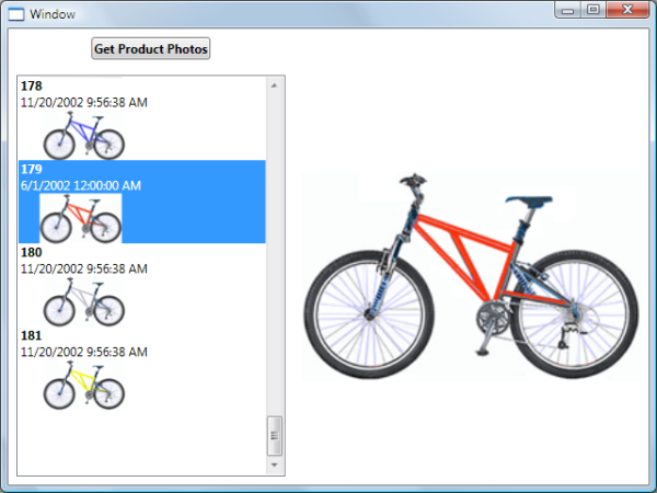
The finished application.