


Layout overview
- Layout panels
- Other layout containers
- The root layout container
- Layers
- Working with child elements
- Complex layout
Microsoft® Expression Blend™ makes it easy to do both simple and complex page layout by using various built-in layout panels or your own custom panels. Layout panels are elements that control the positioning, size, dimensions, and arrangement of other elements that they contain. Layout panels essentially act as containers. The great thing about layout panels is that you can get use out of them just by putting elements inside them.
Layout panels are adaptive in the sense that they can be implemented implicitly, meaning that the overall layout automatically resizes, or auto-sizes, according to the window size. There are several scenarios where this is beneficial, including building user interface (UI) that accommodates varying screen sizes and resolutions, as well as addressing localization needs. You can also choose to use fixed sizes by implementing the layout panels explicitly, meaning that the layout has fixed Width and Height attributes so that an area in the layout stays the designated size even when the application window is resized.
 |
When you change the Width or Height property of an object from a fixed value to Auto, the property is set to the default minimum value. |
You can also transform an element within a layout panel to set a post-layout render position. This is useful for animation (for example, to move an element outside the bounds of a grid panel and have it fly into position). Transformations are relative to the layout position, so the Transform category of the Properties panel shows the default position as being (0,0). In most cases—other than animation where you want an element to move around relative to the final layout position—you will not want to apply transformations to an element within a layout panel.
Layout panels
There are five primary layout panels in Expression Blend, each one designed to manage a different type of layout. The following table describes these layout panels.
| Panel | Description | |
|---|---|---|
 |
Grid | Arranges child elements in a very flexible layout of rows and columns that form a grid. For more information about Grid, see Grid panel. |
 |
Canvas | Arranges child elements according to absolute x and y coordinates. Canvas enables you to have fixed positions for elements on the screen at run time—literally, a blank canvas. For more information about Canvas, see Canvas panel. |
 |
Stack | Arranges child elements into a single line that can be oriented, or stacked, horizontally or vertically. For more information about Stack, see Stack panel. |
 |
Wrap | Arranges child elements in sequential position from left to right, and then when it runs out of room at the far-right edge of the panel, wraps the content to the next line, and so on from left-to-right, top-to-bottom. A wrap panel's orientation can also be vertical so that the child elements flow from top-to-bottom, left-to-right. For more information about Wrap, see Wrap panel. |
 |
Dock | Arranges child elements so that they stay, or dock, to one edge of the panel. For more information about Dock, see Dock panel. |
Other layout containers
There are other layout containers that have some effect on how the elements that they contain are arranged, though these aren't optimized to support the more robust UI scenarios that the primary layout panels handle more eloquently. The following table describes the other layout containers.
| Element | Description | |
|---|---|---|
 |
Border | A simple element that draws a border, background, or both around an element. Border takes only one child element. You likely will want to place a grid or canvas panel within the border so that you can work with multiple child elements. For more information about Border, see Other layout containers. |
 |
BulletDecorator | An element that can only take two child elements, which are typically a text string and a glyph (which represents a control such as a check box). For more information about BulletDecorator, see Other layout containers. |
 |
Popup | A Popup is a window that renders above all other content in an application but relative to another element. You can use a pop-up menu to provide additional information and options to users who interact with the primary piece of UI that the pop-up menu is relative to. Popup takes a single child element and positions itself based on a target element. By default, a Popup has a grid panel as its single child element. The grid panel then enables you to work with multiple child elements inside the Popup immediately after drawing it. In most cases you will not need to directly create a pop-up yourself, because you can instead use a control, such as a menu or combo box, that uses a pop-up menu in its template. For more information about Popup, see Other layout containers. |
 |
ScrollViewer | Allows you to enable scrolling of the child elements that it contains. It takes only a single child element, so in most cases you will want to use a layout panel such as a stack panel, canvas panel, or grid panel within it. ScrollViewer is used within the templates of other controls, such as list boxes, to support the scrolling of content. When the content inside a ScrollViewer is too large, you can enable the content to be clipped. You can also control whether scroll bars are unavailable, hidden, visible, or automatically shown only when needed. For more information about ScrollViewer, see Other layout containers. |
 |
UniformGrid | Arranges child elements within equal, or uniform, grid regions. UniformGrid is not a variation of the grid panel; it can be more accurately described as a tiling layout element, because it creates equal spacing between each element that it contains, based on the number of rows and columns you specify. As you add child elements to a UniformGrid, each element is placed in a region starting from top-left to bottom-right until the UniformGrid is filled. This is useful for a control such as an image list. For more information about UniformGrid, see Other layout containers. |
 |
Viewbox | Scales all of its child elements similar to a zoom control. Because a view box accepts only a single child element, you will typically place a canvas panel or grid panel within it so that you can take advantage of the zoom effect on more than one child element. For more information about Viewbox, see Other layout containers. |
The root layout container
Under Objects and Timeline in the Interaction panel, you will notice that there is an element labeled LayoutRoot. This represents the root layout panel in an Expression Blend document. By default, the layout root is a grid panel. The grid panel, in almost all cases, should be sufficient for top-level page layout. However, you can change the layout root to another layout panel by right-clicking it, pointing to Change Layout Type, and then selecting an alternative layout panel. You can also choose to have a canvas panel be your default LayoutRoot, instead of a grid panel, by clearing the Use a grid panel as the default layout for new items check box in the Project section of the Options dialog box (on the Tools menu).
Layers
Layers provide a quick and easy way to create page-level layout containers for organizing content. Layers are particularly useful for importing content from other programs such as Microsoft® Expression® Design. Artwork that you import from Expression Design uses a canvas panel for each imported layer.
You can create a new layer by using the Create New Layer command on the Tools menu. Expression Blend creates a new layer based on what the LayoutRoot for the current document is.
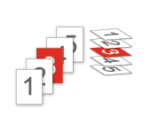
Conceptual drawing of layers.
Working with child elements
Expression Blend attempts to add child elements to the root (or topmost) panel within a document, but if another layout container is active elsewhere in the objects tree, then the child element will be added to that container. You can make an element active by double-clicking the panel or control to which you want to change focus. A yellow highlight around the panel indicates that it is now the active element. The yellow highlight displays in both the artboard and under Objects and Timeline in the Interaction panel. When you create a new panel, and then immediately draw child elements inside the borders of that panel, the child elements will be put into the panel you just created. This is because a newly created panel will automatically become the active element.

 |
The active element in the objects view under Objects and Timeline in the Interaction panel. |
 |
The active element on the artboard. |
Expression Blend also makes it easy to drag child elements between panels to re-parent them into a different layout container. The following image shows an orange ellipse being moved from the root layout grid panel to another grid panel. A dashed bounding box and a text prompt will appear around the panel if the panel can accept a child element. Hold the ALT key before releasing the mouse button to complete the re-parenting action.
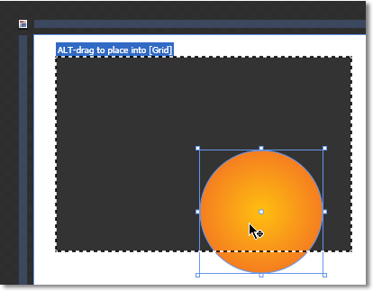
Re-parenting an object from the root Grid panel into another Grid panel.
Complex layout
You often need more flexibility when laying out your page than you can get by using a single layout panel. One way to create complex layouts is by using layout panels as containers for other layout panels. For example, you may want to use a dock panel within the LayoutRoot (which is the grid panel, by default) to break a page into a collection of regions where each region typically contains one or more controls.
For more programmatic information about layout, see the .NET Development section in the Windows Software Development Kit (SDK).