Appearance overview
- Common appearance properties
- Brushes
- Brush resources
- Color and color spaces
- Eyedropper and Paint Bucket tools
- Gradients
- Brush transform tool
- Clipping
- Strokes
- Opacity and visibility
- Bitmap effects
Changing the visual look of an object is a fundamental task in Microsoft® Expression Blend™. By using the properties under Appearance and Brushes in the Properties panel, you can change the stroke color, fill color, opacity, and visibility of a selected object. Depending on what type of object you select in your Expression Blend project, the properties of the Appearance and Brushes categories dynamically adjust to the object's content in order to reflect the appropriate visual attributes.
Common appearance properties
Much of changing an object's appearance has to do with applying brushes to specific properties. The following table describes these properties.
| Property | Description |
|---|---|
| Fill | Sets the brush that is applied to the interior of a shape or path. |
| Stroke | Sets the brush that is applied to the outline (border) of a shape or path. |
| Background | Sets the brush that is applied to the background of an object. This property is typically applied to the background of controls that display text, such as the Button or TextBlock control. |
| Foreground | Sets the brush that is applied to the foreground of an object. This property is typically applied to the text that is displayed in controls, such as the Button or TextBlock control. |
| BorderBrush | Sets the brush that is applied to the border on certain controls. |
| Opacity | Sets the entire object's opacity. |
| Visibility | Determines whether an object is visible or hidden at run time. Child objects can also be affected by the parent element's visibility. |
| OpacityMask | Sets a brush whose color is ignored and whose opacity is transferred to the masked object. Wherever the opacity mask is opaque, the masked object will be opaque; wherever the opacity mask is transparent, the masked object will be transparent. |
Brushes
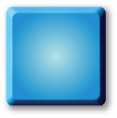
Brushes are used to set the visual appearance of an object on the
artboard. For example, you can use a solid blue brush for the fill of a
rectangle (as in the first image below). Brushes come in several forms, from simple solid color or gradient brushes
to more complex tile brushes. The following table describes the brushes
that are available in Expression Blend. Additionally, you can also use the No brush
 tab to remove all color from the selected property. For example,
to create an outline of a rectangle, you could set the Fill
of the rectangle to No brush, and set the
Stroke to a Solid color brush.
tab to remove all color from the selected property. For example,
to create an outline of a rectangle, you could set the Fill
of the rectangle to No brush, and set the
Stroke to a Solid color brush.
| Brush type | Description | |
|---|---|---|
| Solid color brush |
 |
Composed of a single color. |
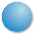
| Linear gradient brush |
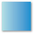  |
Composed of a linear color gradation. |
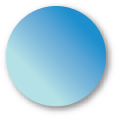
| Radial gradient brush |
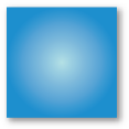  |
Composed of a radial color gradation. |
| Image brush |
   |
Created from an image. From left to right as shown here: the initial image brush, the image brush tiled, and the image brush flipped. |
| Drawing brush |
   |
Created from a vector drawing. From left to right as shown here: the initial drawing brush, the drawing brush tiled, and the drawing brush flipped. |
| Visual brush |
 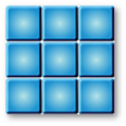 |
Created from a control such as a button. From left to right as shown here: the initial button, and the brush with a Tile mode set to Tile. Note that visual brushes can potentially degrade the performance of the running application, due to the complexity of the control that is used to create the visual brush. |
Brush Resources
After you create a brush on an object, you can convert the brush to a resource that you can then apply to other objects. You can also create resource dictionaries for your brushes so that you can reuse them throughout your project, or even in other projects. For more information, see Create a brush or color resource. For information about resources, see Resources overview.
Color and color spaces
Expression Blend includes a color editor under Brushes in the Properties panel. The color editor also appears if you edit a brush resource in the Resources panel. The color editor has the following four color spaces, as well as a hex mode (#AARRGGBB):
- RGB Red (0-255), Green (0-255), Blue (0-255)
- HLS Hue (360-degree color wheel), Saturation (0% to 100%), Lightness (0% to 100%)
- HSB Hue (360-degree color wheel), Saturation (0% to 100%), Brightness (0% to 100%)
- CMYK Cyan (0% to 100%), Magenta (0% to 100%), Yellow (0% to 100%), Black (0% to 100%)
To change between color spaces, click one of the underlined letters in the current color space to see a pop-up menu of the alternative color spaces.
Eyedropper and Paint Bucket tools
Expression Blend provides two tools that are specifically designed to copy and apply attributes to and from objects. The following properties are copied or applied during Eyedropper and Paint Bucket actions:
- Brushes Foreground, Background, Border Brush, Fill, Stroke, and Opacity Mask
- Appearance Opacity, Stroke Thickness, Stroke Miter Limit, Stroke Start Line Cap, Stroke End Line Cap, Stroke Line Join, and Stroke Dash Cap
- Text Font Family, Font Size, Font Weight, Font Style, Text Decorations, Line Height, Text Indent, and Text Alignment
 |
Eyedropper | Copies the appearance of another object to the currently selected object or objects. |
 |
Paint Bucket | Copies the appearance of the currently selected object or objects to another object. |
Gradients
Gradients enable you to apply a graduated blend of colors to an object, to create a smooth color gradation and to give that object more depth. Perhaps you want to use that object as a background where the left side of the object contains a solid color that gradually fades to white on the right side of the object. This enables you to create two distinguishable areas from an otherwise flat object. You might then create a navigation on the left side of the object and add some paragraphs of text on the right side of the object.
Click Linear Gradient Brush and Radial Gradient Brush
 under Brushes in the Properties panel to switch between the two gradient
brush types.
under Brushes in the Properties panel to switch between the two gradient
brush types.
You can use the two types of gradient brushes to create gradient fills, gradient strokes, text
that has
a gradient for its Foreground property, or gradient backgrounds for any
element that has a Background property. When you apply a gradient to an appearance
property, notice that small icons
 ,
known as stops, appear on the gradient slider. You can change the color
of each gradient stop, and add as many stops as you want to the gradient
slider simply by clicking on the gradient slider. Conversely, you can easily
remove stops that you no longer need by simply dragging them off the bottom
of the gradient slider (dragging off the sides or top of the slider will
not remove the stops).
,
known as stops, appear on the gradient slider. You can change the color
of each gradient stop, and add as many stops as you want to the gradient
slider simply by clicking on the gradient slider. Conversely, you can easily
remove stops that you no longer need by simply dragging them off the bottom
of the gradient slider (dragging off the sides or top of the slider will
not remove the stops).
There are also some options that you can set when using a gradient
brush. Click the Options button at
the bottom of the color editor to set the gradient mode to Pad,
Reflect (which mirrors the gradient fill), or Repeat
(which repeats the gradient fill). These options work on both linear and
radial gradient brushes when you use the
Brush Transform
 tool to modify the brush. For more information, see
Brush
transform tool below.
tool to modify the brush. For more information, see
Brush
transform tool below.
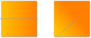
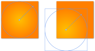
Brush transform tool
To transform the fill, stroke, opacity mask, or other brush that is applied
to an object, select the brush property in the Properties panel, and then select the Brush Transform
tool on the Toolbox. A brush transform arrow will appear on the
artboard that you can modify with your mouse pointer. If you are using a
gradient brush, the endpoints of the transform arrow correspond to the gradient
stops at either end of the color bar.
You
can change the behavior of the brush transform tool in the following ways:
- Hold the SHIFT key while dragging an endpoint to constrain the
movement along the straight line between the endpoints.
- Hold the SHIFT key while moving the entire arrow to constrain the
movement to the X or the Y plane.
- Hold the SHIFT key while rotating an endpoint to snap every 15
degrees.
- Hold the ALT key while dragging an endpoint to move both endpoints at the same time, maintaining the position of the center point.
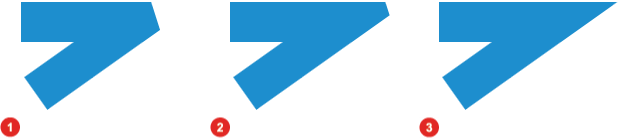
The following images demonstrate the appearance of a rectangle object after various transformations are applied to the gradient brush of the Fill property.
Transformations applied to the fill of a rectangle: linear gradient brush (top), and radial gradient brush (bottom)
You can optionally set the properties that appear when you click the Options button under Brushes in the Properties panel. In the preceding image, the Pad option is selected. If you selected the Reflect or Repeat option, and then made the transform arrow shorter than the object, you would see a corrugated effect.
You can transform brush types other than gradient brushes. For more information about brush transforms, see Transform a gradient or tile brush.
Clipping
Sometimes, when you transform a brush, parts of the object will be clipped (that is, parts will disappear outside of the bounding box). You can fix clipping problems in the following ways:
- Deselect the checkbox for the ClipToBounds property under Appearance in the Properties panel.
- Use the properties in the LayoutTransform category instead of the RenderTransform under Transform in the Properties panel. This is particularly useful when transforming a visual brush.
Strokes
Strokes are the borders on objects. You can change the applied brush (solid, gradient, or tile), opacity, width, and miter limit of the stroke on an object, as well as the corner join and end-cap styles. The stroke on an object is always applied on top of a fill, even if you have no fill applied to that object. To make any changes to the stroke of an object, you must have Stroke selected in the list under Brushes in the Properties panel.
- Stroke width The width of a stroke on an object is measured in pixels (or, device-independent units which are approximately 1/96 inch) and can have a value between 0 and up to half of the shape's width or height. In general, after the stroke thickness reaches half the shape's width and height, the stroke covers all of the fill. You can set the stroke width value by using the StrokeThickness property under Appearance in the Properties panel.
- Corner joins For objects that have
sharp corners, such as rectangles, you can change the way the stroke
looks at each corner point by applying one of three corner join styles:
Miter Join
 ,
Round Join
,
Round Join  ,
and Bevel Join
,
and Bevel Join  .
You can set the corner join style by using the StrokeLineJoin
property under Appearance in the
Properties panel.
.
You can set the corner join style by using the StrokeLineJoin
property under Appearance in the
Properties panel. 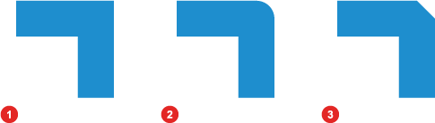
The effects of the different types of corner joins: 1) Miter, 2) Round, and 3) Bevel
- Miter limit The miter limit controls how
long the corner point of a miter join can get before it is automatically
squared off into a bevel join. You can set the miter limit by using the StrokeMiterLimit
property under Appearance in the
Properties panel.
The following image displays three angles with a StrokeThickness
of 40, and a StrokeMiterLimit
of 1 ,
2.2 ,
and 4 . The size of the angle and
the stroke thickness determine the visual effect of the miter limit.
The effects of different StrokeMiterLimit values: 1) 1.0, 2) 2.2, and 3) 4.0.
- End caps For paths that contain unconnected
ends, such as lines, you can change the way the stroke looks at each
end by applying one of four end cap styles:
Flat Cap ,
Round Cap ,
Square Cap , and
Triangle Cap
 .
You can set the end cap style by using the
StrokeEndLineCap or
StrokeStartLineCap properties under Appearance
in the
Properties panel.
.
You can set the end cap style by using the
StrokeEndLineCap or
StrokeStartLineCap properties under Appearance
in the
Properties panel.
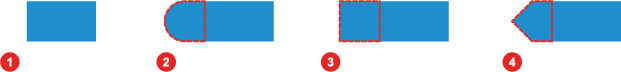
The effects of the different types of end caps: 1) Flat, 2) Round, 3) Square, and 4) Triangle
Opacity and visibility
When you decrease the opacity of an object, you increase its transparency, so you can see other objects that are behind it. Opacity is controlled by an alpha channel that stores all the transparency information for an object, gradient, or opacity mask. The following table describes three methods that you can choose between to change the opacity of an object.
| Method | Results |
|---|---|
| Opacity Changes the transparency of an entire object, including all of the object's visual attributes. The image to the right shows the opacity value set at 60 percent. |
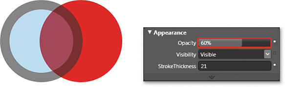 |
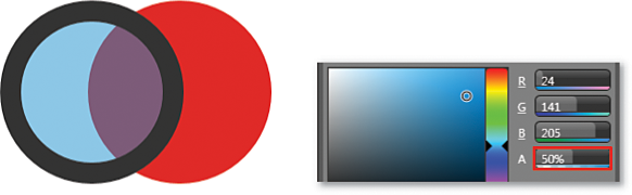
| Transparency Sets the alpha value (A) of an individual brush attribute for an object, such as the fill or stroke, slightly transparent without having to change all attributes on a single object. The image to the right shows that only the fill for the ellipse is more transparent, because the alpha value for the fill is set to 50 percent. The stroke for the ellipse remains at 100 percent. |
 |
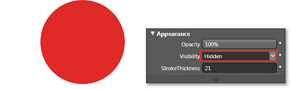
| Visibility Enables you to hide or show an object at different times. This is especially effective in animation when you don't want to remove an object completely from the artboard. In the image to the right, the left object that has a blue fill and a thick black stroke and that is part of the preceding two images in this table is now set as Hidden. |
 |
Bitmap effects
Bitmap effects are simple pixel processing operations.
 |
In Windows Presentation Foundation (WPF) applications (like those created with Expression Blend), pixels refer to device independent pixels or device independent units which are equivalent to the size of a pixel on a monitor that is set to a screen resolution of 96 DPI. Each unit is approximately 1/96 inch, regardless of monitor size or screen resolution. |
The following table describes each bitmap effect that is available in Expression Blend. Bitmap effects are available under Appearance in the Properties panel when an object, such as a rectangle or button, is selected. Each bitmap effect exposes subproperties, such as the Radius of the Blur bitmap effect. The pixel processing that is required to render bitmap effects and the object to which those effects are applied occurs at run time. For this reason, you should not apply bitmap effects to large visuals or animations, because this can degrade the performance of your application. For information about setting bitmap effects, see Add a bitmap effect to an object.
| Effect | Description | |
|---|---|---|
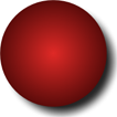
| None |
|
Button without a bitmap effect applied. |
| Blur |
|
Simulates looking at an object through an out-of-focus lens. |
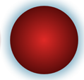
| Outer glow |
|
Creates a halo of color around the perimeter of an object. |
| Drop shadow |
|
Creates a shadow behind an object. |
| Bevel |
|
Creates a bevel that raises the surface of an image according to a specified curve. |
| Emboss |
|
Creates a bump mapping of a visual to give the impression of depth and texture from an artificial light source. |