


SimpleExpander
The expander is a headered content control that displays both a header and a collapsible window, which displays content. You can title an expander in Microsoft® Expression Blend™ by modifying the Header property. You can place content in an expander by double-clicking the expander and then drawing an element into it. If you want to place multiple elements into an expander, you need to first add in a layout panel such as a Grid or Canvas. An expander also can display text by default; you can edit the text by right-clicking the expander, and then clicking Edit Text. To view the expander on the artboard while it is expanded, you can right-click the expander under Objects and Timeline, and then click Expand Expander.
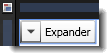
The artboard view of a SimpleExpander control.
Breaking down the control template
The SimpleExpander control template consists of the following items:
- A Grid, which is a layout panel that is needed to hold the multiple children within the expander. The Grid is also used because it makes it easier for an application user interface (UI) designer to add more elements to the template. The Grid is divided into two areas: the Border area that represents the header, and the ExpandSite area that represents the content.
- A Border element, which is used because it includes a BorderThickness property that can be template-bound to the BorderThickness property of the expander control to which this template is applied.
- A ToggleButton element, which is contained within the Border element and which expands and collapses the expander.
- A ContentPresenter element, which is contained within the Border element and which is automatically bound to the Header property of the expander control to which this template is applied.
- A ContentPresenter under the ExpandSite area, which is used to display the Content property of the expander to which this template is applied. Both ContentPresenter elements must be present to make the expander work as expected.
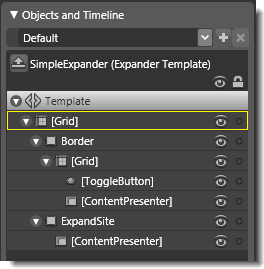
Objects view: The basic parts (template) of a SimpleExpander control.
Property triggers used
Property triggers in the control template are used to make the control react to property changes. You can click the items under Triggers in the Interaction panel to view the properties that are changed when a trigger is active. For example, in the SimpleExpander template, when the IsExpanded property becomes True, the ExpandSite area becomes visible.
Brushes used
The following brush resources in the SimpleStyles.xaml resource dictionary are used by the SimpleExpander template:
- The Background property is set by using the LightBrush when no trigger is active, and by using the DisabledBackgroundBrush when IsEnabled is False.
- The BorderBrush property is set by using the NormalBorderBrush when no trigger is active, and by using the DisabledBorderBrush when IsEnabled is False.
- The Background property of the Border element is set by using the NormalBrush when no trigger is active, .
- The Background property of the ExpandSite element is set by using the WindowBackgroundBrush when no trigger is active.
- The BorderBrush property of the ExpandSite element is set by using the SolidBorderBrush when no trigger is active.
- The Foreground property is set by using the DisabledForegroundBrush when IsEnabled is False.
Best practices and design guidelines
- In general, use a Grid control as the root of your template if you expect a designer to add further visual elements to your control. Expression Blend looks for a layout panel like the Grid control and makes it active by default so that new elements that are added to the artboard end up as child elements of the layout panel.
- Because the expander has two ContentPresenter elements (one for the header and one for the content), the ContentPresenter in the header needs to be explicitly set to the class of the control. To do this, set the ContentSource property of the ContentPresenter element (in the Border node of the template) to Header.
- The ToggleButton element uses a separate template named ExpanderToggleButton. To modify this, right-click the ToggleButton element, point to Edit Control Parts (Template), and then click Edit Template or Edit Copy. The ToggleButton is connected to the rest of the expander by a binding between IsChecked on the ToggleButton and IsExpanded on the expander. For this property to be correctly updated, you need to keep this binding—the two-way binding allows you to programmatically expand the expander.
- By default, the ExpandSite area is collapsed and is made visible by a trigger. Because the trigger references the ExpandSite element by name, you need to also update the IsExpanded trigger if you change or replace the ExpandSite element.